

Instagram just gave one of its most recognizable design elements a makeover, but the internet is already wishing it had stayed exactly as it was.
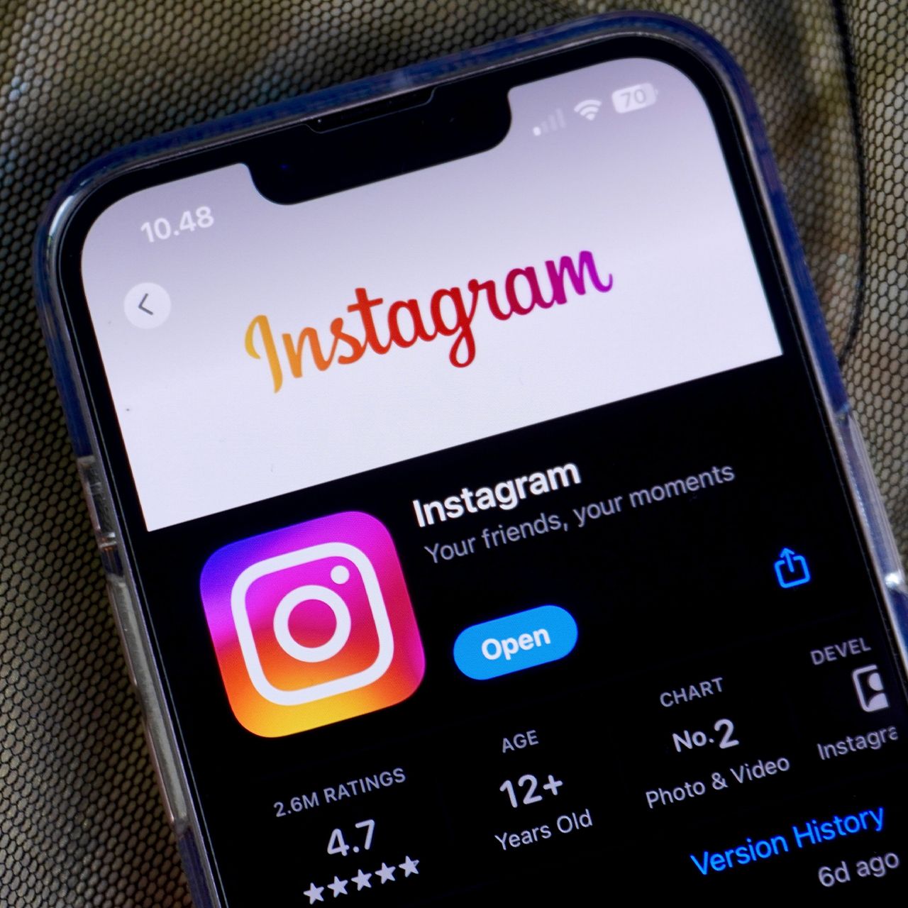
After a decade, Instagram has changed the familiar cursive font in its logo that has appeared across the platform since 2016, giving it a more modern, simplified look. The redesign was revealed by Instagram CEO Adam Mosseri, who described the update as a cleaner refresh that still paid tribute to the logo’s original aesthetic. But instead of embracing the new look, many users quickly slammed the updated lettering, with some saying it looks overly basic, difficult to read, and even “AI” generated. Read more about the controversial logo update and how the internet reacted to it below.
Instagram Changed Its Familiar Logo Font For The First Time In 10 Years
Instagram is one of today’s most iconic and popular social media apps, which is why many of its users like to have a sense of familiarity amongst all of its new and flashier features that have popped up over the years. Therefore, when the app’s CEO announced a change to its iconic logo last week, it triggered a strong reaction.
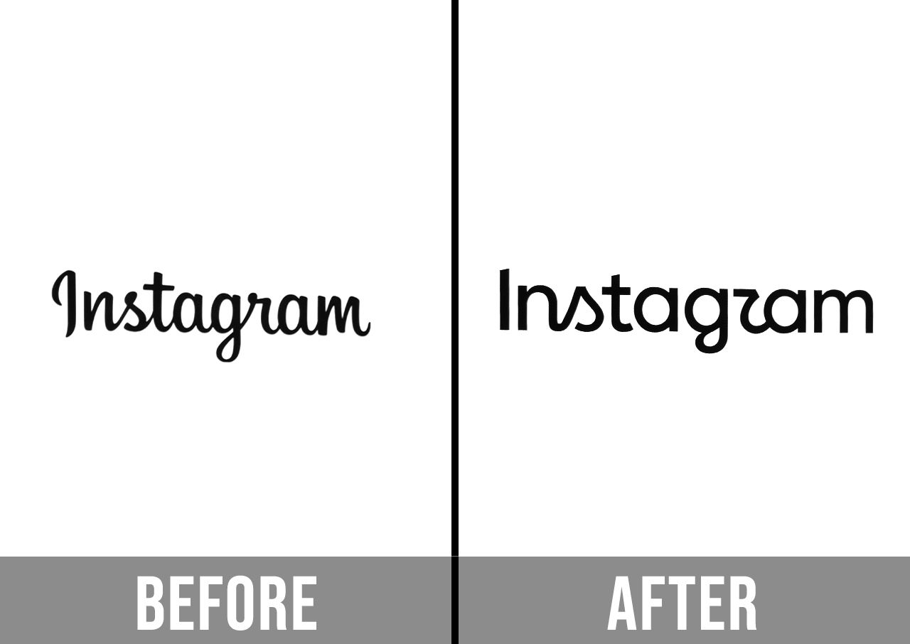
The biggest change is to the word “Instagram” itself, rather than the colorful camera icon users look for with the app. The longtime cursive lettering has been replaced with a redesigned wordmark that blends cursive and more basic letters. Some of the letters are noticeably rounder, with the new “r” in particular becoming a major source of confusion online, as some people even thought it made it look like the word “Instagzam.”
Instagram head Adam Mosseri explained the reasoning behind the redesign in a recent Instagram caption on his own profile, writing, “The wordmark at the top of the app hasn’t changed in 10 years, so it was time for a refresh. Cleaner and more modern, with references to the original and the simplicity and craft that’s always made it Instagram.”

Women Are Swapping Their Boring Water For This Ice Pop Electrolyte Mix!
Instagram Users Slam The New Logo Font In Comment Sections
While Instagram and Mosseri presented the redesign as a low-key modernization, many users saw it as an unnecessary downgrade. The biggest complaints have mostly been about the new font being harder to read, with the new cursive letters leaving people believing it looks almost like an entirely different word. Others simply felt that the previous logo had more personality and character.
The backlash also quickly turned into jokes about the new design looking "AI" generated or overly generic, and it didn't take long for them to start requesting that the old one come back.
"Unpopular opinion: The old cursive logo felt iconic and personal; this new version looks like a generic tech startup font template," commented a user under a side-by-side post of the old and new font.
"Is it because Gen Z can't read cursive?" joked another.
"The old one looks friendly and human; the new one looks unnatural and AI-machine," wrote a user.
"What a downgrade," a user wrote, as another added, "Thanks, I hate it."
"Bring back the old one," commented one of many users, as another wrote, "It looks so AI and basic."